And then I realized it was just because I didn't feel like the pages were vintage enough for me. I wanted that magical grimoire of old aesthetic and my modern pages just weren't capturing it!
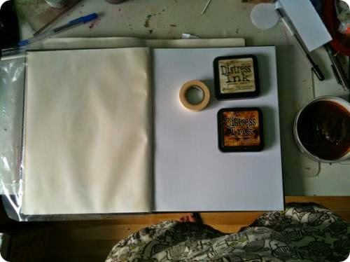
So I went back to the basics and started with tea staining some pages in an art sketch book I have:
If you look closely you'll notice a few things about this photo. First, the trivial stuff: my owl apron and purple toes. Have I mentioned that I love owls? And purple? Yeah. I do. And that I always paint with an apron cause I'm a bit of a chaotic mess with the paint and well, hell, it gives me an excuse to buy and make aprons, which I love. LOVE! Also, that my work desk is a bit of a disaster (thank gods for the crop tool, which cuts out the worst of it).
Ok, now the serious stuff! On the right side are the staining things I used. A bowl with water and tea bags for the base stain coat. Tim Holtz distress inks in vintage photo and antique linen to create more texture and depth to the background colour. I also used tape to reinforce the seems between the pages. On the left you can see the first wash of colour using the tea stain only.
After the tea stain, I dabbed a wet brush into my ink pads and blended it into the page. The photos are of the vintage photo ink being blended into the page.
And then I started playing with stamps, paper, and texture. I actually find the vintage stamps from Tim Holtz to be great for creating that antique feel but also loved the look of my leaf stamp on the page. Here are some of the pages I've created so far:
I like some better than others. As my husband pointed out, the sticker letters don't quite fit with the antique page feel on the "moon in taurus" page. Ironically, I think the moon in capricorn (2nd in top row) looks better in person than in the photo but have realized that I need to brush up on my calligraphy skills if I really want to create that antique look.
At the end of the day, I'm still pretty pleased with the book so far because it's really just a trial book to see what works and doesn't work. And I think that I'm starting to get a sense of that as I go. And once I get the foundation right, I'll start reworking the actual scrapbook page.
Source: magick-keys.blogspot.com


